Elliots Irrigation Pty Ltd. is highly specialist in the irrigation industry and is well-known for their many large scale projects. It has serviced the residential and commercial sectors of Western Australia’s irrigation market since 1984 as suppliers, designers, installers and maintenance personnel. Also included in the services they cater are iron filtration and agricultural irrigation design. The company also encourage potential customers to venture and discuss your needs, as you will notice that in irrigation, Elliotts have few peers. They are not a member of a chain of stores; this is the home of our expertise, designers, management and hands on staff.
Project Overview
For over 20 years, Ellioit’s Irrigation has established a strong reputation in the groundwater industry for its dedication and commitment to a high quality work. With achievements the company has accomplished, leading the industry in the 21st century is what they’re aiming for.
With that, certain strategies are being planned to implement. A thorough study about the innovating market industry, their competitors and sales forecast are being done. This is to understand what are the needed changes to be made in order to achieve their goals.
Elliot’s Irrigation Pty Ltd decided to improve their website to improve its online visibility, responsiveness and audience reach. With the help of BMC Solutions, Elliot’s Irrigation Pty Ltd website will have a more professional look, user-friendly and efficient in delivering information when it comes to their products and services, thus, making it competitive with other websites in the same industry.
Improvements on the site focus on changes made with texts, menus, colors, layouts and images.
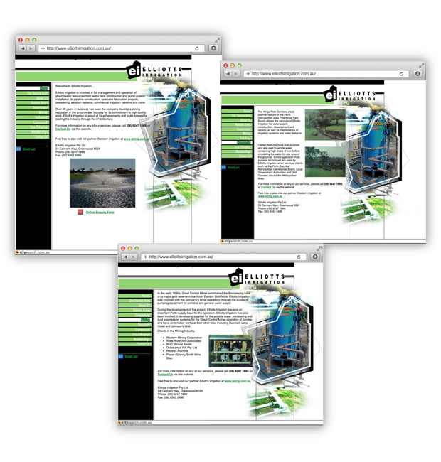
Previous Website
The previous website of Elliot’s Irrigation Pty, though providing information about their services is not that enticing and professional-looking. The white and green colors made up the page layout. The logo, fonts, menus and overall design creates an impression of the need to be updated and improved. The menus are located on the left side of the homepage which does not provide an easy visibility for the users. The previous website is also not responsive to mobile, thus decreasing the chance of better reaching more audience.
Our Solution
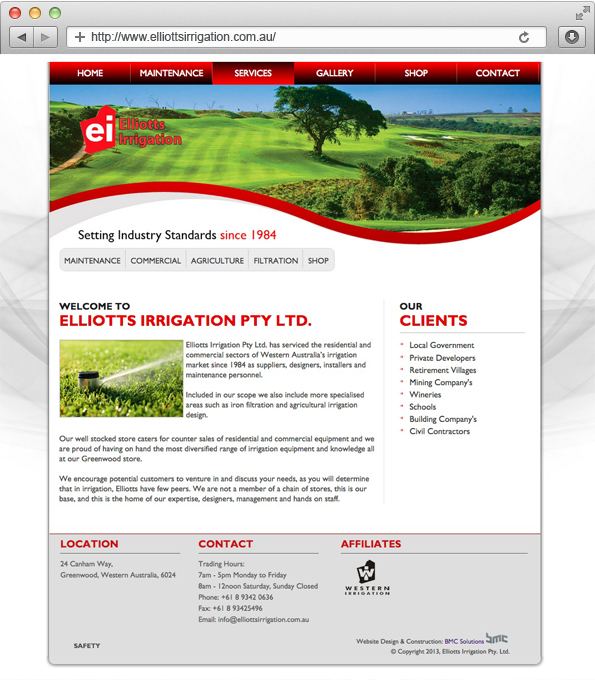
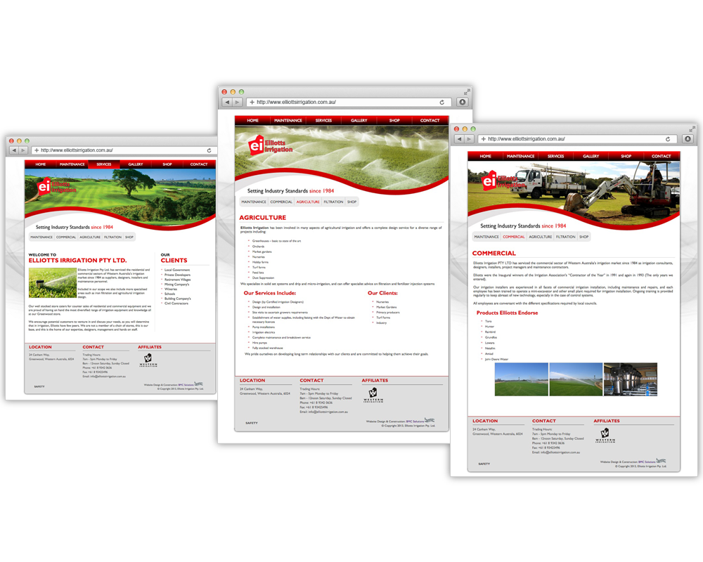
In today’s innovation when it comes to website improvement, functionality and enticing designs are essential. We choose the combination of red, green and white for the website’s color scheme.
This makes the website more visually enticing. Menus are then added at the header and categories are also placed in the homepage to make it easy to the visitors to get the details they need and a quick information of what the website is offering.
Contact page is also improved and is added at the footer. We have also added a ‘Shop’ Menu so that products and services they are offering will be comprehensively detailed for the customers.
Outcome
After implementing all the solutions and the changes agreed to be applied on the previous website, it is great to see that the website looks professional, visually enticing, responsive and more user-friendly.
The setting up of menus added to better functionality since information about the website is now more organised to all the visitors. Having the Shop menu and Contact page and information at the footer also helps to make it easy for customers to get in touch with the company.


